
The super smart Wimbledon sponsorship (that didn’t exist)

Karen Haller

Every year during Wimbledon, I head to Wimbledon Village to look at the shop fronts. The whole place embraces the Championships, with cafés, restaurants and retailers finding their own way into the tournament.
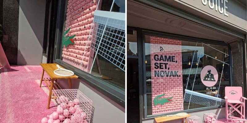
This year, one display stopped me. Joe and the Juice had teamed up with Lacoste, transforming its storefront with a pink tennis court, pink tennis balls and the words:
Game. Set. Novak.
I remember looking at it and thinking: that’s clever.
Lacoste barely needed an introduction. The crocodile, the clothes and decades of sporting association already place it naturally in the world of tennis.
Joe & The Juice had a different job to do.
It used its distinctive pink to bring Wimbledon into its own visual world. Rather than borrowing the tournament’s identity, it made tennis recognisably Joe & The Juice.
But why were these two brands collaborating?
That was the part I couldn’t work out, so I looked it up.
The connection was Novak Djokovic. He is an ambassador and investor in Joe & The Juice, while Lacoste has sponsored him since 2017.
Then I discovered something else: Lacoste isn’t an official Wimbledon sponsor.
I had simply assumed it was.
That’s what makes the collaboration so smart. The setting, sporting references, shared ambassador and visual identities created a connection that felt completely natural – even though the official connection I imagined wasn’t there.
When I originally wrote about the collaboration on LinkedIn, retail expert Ian Scott picked up on another reason why it worked.
I first met Ian when he led a Crown Paints Colour Safari exploring how colour was being used across London’s retail spaces, and I’ve valued his observations on retail ever since.
“What I really like about this is how Joe & The Juice have been so considered and comprehensive about the implementation,” he said. “As you say, it’s easy to assume that this is an official collaboration because of its cohesive integration.”
Ian’s point about the implementation stood out to me because having the connections between the brands was one thing, but they still had to make those connections visible. It was how consistently they did that across the entire display that made everything feel as though it belonged together.
And colour was a significant part of how they did that.
Lacoste arrived with an association people already understood. Joe & The Juice used colour to create its own place within the story.
Colour doesn’t merely make a brand recognisable. Used intelligently, it can help a brand enter a conversation, signal where it belongs and shape the connections people make before a word of explanation is given.
That’s where colour psychology becomes commercially useful.
Understanding the associations your colours create allows you to shape those instant assumptions and make sure they support the story you want your brand to tell.
It’s worth asking what people assume about your brand before they’ve read a single word.
If you’re not sure what your colour is communicating, I’m always happy to help you look at it.
Colourfully yours,
Karen
Image: Karen Haller