
recognise these brands by their colours alone?

Karen Haller

This month’s brand blog I thought I’d try a little game to demonstrate how we can recognise brands by colour alone. Even if we haven’t bought anything from these major brands, through marketing and advertising we still have them stored in our subconscious memory. We only have to walk down the street or drive on the highway to see brand signs and billboards and before we’ve even read the words we have taken in the colour and we know who they are.
So here I’ve picked out six well-known brands for you to see if you can recognise who they are…
brand 1

Why is Facebook blue? The New Yorker reported that Mark Zuckerberg is red-green colour blind “Blue is the richest color for me; I can see all of blue.” Apparently it’s also his favourite colour. And when it comes to the psychology of blue, it just so happens to be the colour of communication.

brand 2

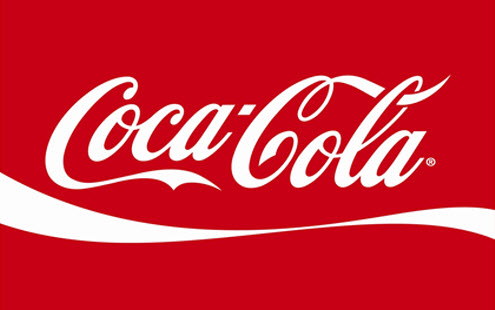
Major brands use colour to their advantage. They use their brand colour to engage with their customer’s emotions and encourage them to buy. Over the years their packaging and logos may have changed but Coca-Cola have kept their bright red brand colour. This shows they understand the emotional response the colour elicits in their target market. In this context red conveys feelings of being energised and alert. It speaks to us of energy, power, stimulation and upbeat emotions; saying that people who drink Coca-Cola have a good time.
brand 3

There are a few brands that use red and yellow, however this brand is the one that sticks in our mind. When it comes to the positive psychological qualities of red & yellow in relation to the fast food industry, red triggers stimulation, appetite, hunger…it excites, whilst yellow triggers the feelings of happiness and friendliness. They also want customers to eat quickly and go. It is fast food after all. The emotions the colours elicit attracts their target market. If you want to attract your target market click here.

brand 4

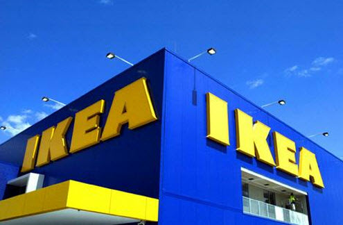
Recognised worldwide for its blue and yellow brand colours, IKEA’s founder choose these based on his country’s national flag – Sweden. IKEA certainly uses their brand colours to full effect with their store exteriors decked out in yellow and blue. This increases brand recognition and leaves no confusion as to who they are. Although IKEAs brand colours are symbolic, the psychological properties of these two colours are still in play.
brand 5

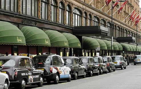
Often Harrods is depicted as only having one brand colour – dark green. It actually has two core brand colours, the second being gold. Harrods is steeped in tradition, old-fashion service and high quality. If you brands needs to exude high quality click here.
brand 6

The famous Tiffany & Co. blue sometimes described as robin’s egg blue is steeped in history. Research suggests it may have been chosen because of the popularity of the turquoise gemstone in 19th century jewellery. It was also a favourite of Victorian brides who gave their attendants a dove-shaped brooch set with turquoise so that they would not forget the bride. The brand identity is so strong Tiffany & Co. have trademarked this specific tone.

So what’s so important about colour and branding…?
Colour is emotive and the saying is true, we buy with emotion and we justify with logic.
Big brands spend a lot of money working to get their brand colours right.
Get yours right. Click here to start Building Your Own Brand.


