Why you can’t learn colour psychology off the internet

Karen Haller

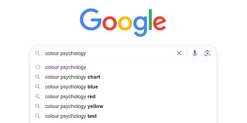
I was interviewed on a podcast aimed at interior designers, and during our conversation the host mentioned that she uses colour psychology in her design work. Curious about her sources, I asked where she’d learned about it. Her reply was simple: “I just Google colour psychology.”
This isn’t the first time I’ve heard this and it’s a response that makes me put my head into my hands. Here’s why.
The host was right. If you search for ‘colour psychology’ or ‘colour psychology infographics’ on the internet or ask about it inside ChatGPT or other AI apps, you’ll discover endless references
that are attributed to colour psychology.
The problem is, they are full of information on colour in culture, personal colour association, colour preferences, Feng Shui, Chakras, Vaastu, colour healing, colour therapy, etc.
None of these are colour psychology. They are separate modalities that are completely different, so all these articles and infographics are misleading.
When designers have gone to implement this misleading information into their designs, they don’t get the results they were expecting. I’ve seen this happen in the build environment, interiors, branding, products, fashion, etc.
If you’ve tried to implement colour psychology this way, you probably felt confused by the results and it’s likely so did your clients.
And it left you thinking that colour psychology is a load of rubbish and dismissed it.
This makes my heart break and it’s why I’m writing this blog today. If you follow colour psychology from simply doing an internet search, it’s highly likely you’re not going to get the results you were expecting which will lead you to believe it’s not as powerful as it is. And it gives colour psychology a bad name.
I actually give theses articles and infographics to my colour and design psychology students as they are great practise for them to identify all the different modalities, the myths and the misconceptions that are commonly attributed to colour psychology. When they are clear on what is colour psychology and what isn’t, they can speak to them when it comes up with their clients. And this happens more often than you think.
To help you identify what is colour psychology and what isn’t I’m going to share three common concepts that are mistaken as colour psychology.
Here are three common colour psychology misconceptions
Red stimulates the appetite
This idea is attributed to colour psychology, but it is a misconception. It came from seeing owners of Chinese restaurants using red throughout their interior décor. The belief being that red is stimulating our appetite and we will want to eat more. This is a myth.
In Chinese culture, red is the colour that represents good luck. What the restaurant owners are doing here is using red to wish good luck, good fortune, and prosperity on their business. Nothing to do with appetite.
This is an example of colour in culture (also known as colour symbolism) where specific colours have a meaning which has symbolic significance within that culture, whereas colour psychology focuses on how colour can influence how we think, feel and behave.
A cultural colour is defined as one thing whereas in colour psychology, colour isn’t just one thing. It has positive and adverse traits which is brought out through the context it’s used in, the specific tint, tone or shade, the proportion used and the placement. Colour psychology goes a lot deeper and is more complex than a colour means a single thing.
Pink is for girls
How many times have we heard this?
This association that pink is for girls is a myth. A marketing myth.
When it comes to colour psychology, some of the positive traits are caring, nurturing and compassion. It’s expressed when we show empathy.
Meaning males can relate and connect to the emotions expressed by pink just as much as females can.
I had a lot of mothers at one stage say to me, “should I be worried that my son loves pink?” which led me to coin the phrase “If cuddles were a colour, it would be pink”.
The negative association that pink is a ‘girly colour’ and makes you appear childish and immature likely comes from the adverse psychological traits of this colour where you can feel emasculated, weak and needy.
Blue is calming
This is a common misconception that all blues are calming. This misleads designers to think that all blues are the same no matter the tint, tone or shade. In fact this is the same for any colour.
In colour psychology every colour has positive and negative traits. Some blues are be calming and soothing but there are blues that stimulate and excite, as well as feel uninviting, distant and aloof.
From a colour psychology perspective colour is very nuanced. It’s never one-dimensional, so the idea that a colour and all its variations create the same feelings and responses is misleading and very limiting.
Understanding colour at the subconscious level
Unlike what you’ll find in articles and infographics in your internet search, colour psychology isn’t a mash-up of modalities. It is its own standalone modality based in nature and science, not on cultural or spiritual belief, or our own personal taste or memory associations.
While designers use these other modalities mentioned earlier, what might not be known is whilst they are applying the colours using that particular modality’s principals, underneath that we are still feeling the affects of the colours on a much deeper level.
This is what makes colour psychology different and far more nuanced than any other modality – it deals with how we subconsciously react to colour and how these responses influence how we think feel and behave.
So what this means is while you might choose to use colours that have cultural significance or based on your client’s personal taste, they will still be experiencing a subconscious psychological response to those colours.
That’s why no matter what modality you use, understanding the positive and adverse impact those colours are likely to have from a colour psychology perspective is crucial to you creating the results that your client is wanting whether that’s for a brand, a product, a space or an individual.
Is Colour Psychology what you need?
This is why I’m such an advocate for colour psychology as a real support for designers, modality practitioners, or anyone using colour in their work, because it 100% complements and supports them to deliver the results they want for their clients on both the conscious and the subconscious levels.
This is the thing about using internet searches for colour psychology, they are rarely going to give you what you want because they can’t explain the depth and the nuance the training in colour psychology delivers. In knowing how colour impacts us at that deep level supports you to understand how environments, our brands, our products, our clothes can influence our thoughts, emotions, and behaviours. And when you know that you can repeatedly deliver results that your clients rave about.
To find out more about the common myths that mislead designers and creatives, download my free e-book, The 10 myths that Limit You Using Colour Successful.
Colourfully yours,
Karen


