
The Not-So-Unexpected Red Theory

Karen Haller
Chances are you’ve heard about the unexpected red theory? It’s been all over the internet and in the media. It seems like everyone’s been talking about it.
But if you haven’t, this ‘theory’ was created by Taylor Simon, a Brooklyn-based interior designer who is known for her eclectic style.
The idea, according to Taylor is once a red item has been added to a room, the room automatically looks better.
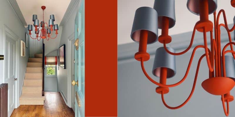
In her viral TikTok video she said, “The unexpected red theory is basically adding anything that’s red, big or small to a room where it doesn’t match at all… these things have no business being red but automatically looks better.”

She goes on to suggest adding a pop of red into a room on a lamp shade, bathroom sink, picture or mirror frames and because that pop of red is unexpected in the scheme, it can liven up the room, update it and make it look “so fresh”.

Here’s why the unexpected red theory isn’t that unexpected
According to current scientific understanding, red advances towards us the quickest of any colour which is likely because of how fast we know the wavelengths of light travel. For red it’s at around 700 nanometres whereas violet it’s 400 nanometres.
We see red before any other colour.
So this suggests if red is used in a space, on clothing, in branding, you’re going to notice it first.
You’ll have seen supermarkets use red sale signs, so your eyes are drawn to it, straight away. And you’ll also notice that stop signs and emergency exit signs are red too. These are all intentional. They are designed to be noticed. To attract our attention. We can’t help but take notice.
And think about when you are out in a sea of people, it’s those wearing red that you notice first.
Unexpected red could as easily be unexpected orange
It’s not just red, it’s all of the colours that are high chroma whether it’s a bright orange, lemon yellow, magenta pink, turquoise, or whatever vivid colours will all by themselves create that focal point.
This trend really took off a decade or so ago when the trend for more monotone, ‘neutral’ and grey schemes were the height of fashion.
The idea here was by simply using a vivid ‘pop of colour’ it would brighten, lift and bring life to a room, an outfit, accessories, a brand etc.
Want to create your own unexpected colour pop?
So if you’ve been following the unexpected red theory, don’t feel limited to just using red.
If you want to create that ‘pop of colour’, that colour focal point in your design schemes, in your interior spaces, clothing, accessories etc, here are three ways that you can do that.
- Choose your colour. E.g. blue, green, yellow
- Choose the high saturated version. E.g. turquoise, lime green, bright yellow
- Make sure it’s of high contrast to any other colours being used in the space and it truly does stand out and ‘pop’.
Top tip: And to make it really unexpected, put the colour in places where it’s not expected such as door frames, shelf edges, inside drawers, and skirting boards which is becoming more common. Seeing colour in these unexpected places can become moments of surprise.
What I love about new things like this that come into the industry is, it supports us to experiment and have fun using colour.
But you know what I’m going to say, don’t you?!?!
So when you’re picking your pop of colour, make sure you’re considering how that colour is going to impact the people in the space or however you’re using it.
Every colour, no matter what it is, along with the other colours it’s combined with, will have an impact on how we think, feel and behave. So make sure you’re factoring the positive and negative traits of all the colours into your scheme.
So what’s your thought on this ‘unexpected red theory’? Do you agree with Taylor that using red on “things [that] have no business being red automatically looks better.”?
If you could use any pop of colour, what would you choose?
Sources:
Taylor Simony TikTok
Extracts from The Little Book of Colour
Images:
Hallway image: courtesy of Melanie Lissack Interiors
Other images: courtesy of Martha Roberts


