business branding colours… meaning of pink

Karen Haller
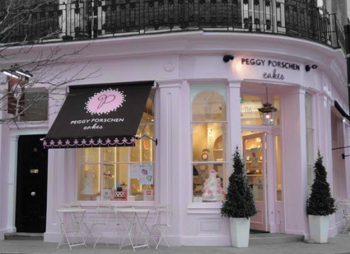
When I started researching for this article, I didn’t realise I would find so many businesses that use pink as their main branding colour. On one hand this may reflect an increase in women going into business or more female related services. On the other hand I did find it surprising given the back lash against pink being marketed at little girls. It seems when it comes to marketing to women pink is all the rage.
What message is being conveyed when a brand chooses pink as their primary branding colour? 
colour psychology
Positive qualities of pink represents feminine love, nurturing, and caring, maternal love. From these positive qualities you can see why the energy of the softer, gentler tones pink would resonate with little girls.
On the negative side it can come across as needy, weak, helpless and emasculating. When a company whose primary branding colour doesn’t uphold the values of pink its brand personality will come across with these negative traits.
colour balance
Do you have another colour or colours making up your brand identity? Take care when selecting other colours and their tones as they will also have their own psychological properties. You could, inadvertently being sending out a completely different personality to the one you intended.
romantic pink
Peggy Porschen’s bespoke cake boutique just exudes the feelings of old world romance and delicate girlie femininity. It’s no surprise there have been more than one wedding proposal witnessed here, such is the romantic atmosphere.
emotive selling
Even the big brands see the value in creating products in colours if they believe it will sell. They are emotionally connecting with their target market. As you can see from the example below, these three brands have each selected a tone of pink they feel will ‘sell’. Each tone has its own ‘personality’ and will be attractive to different personalities.

Business Branding - Can you guess which segment of the market mobile giant T Mobile are aiming for? | Image - T Mobile
women’s networking groups
Have you noticed the proliferation of women’s networking groups who are using pink? And not just any pink but cold blue magenta. Do they know what they are really communicating in combination with their other brand colours? If the tone of colour isn’t in keeping with your business brand’s personality, you could be communicating feminist and militant than caring and nurturing.
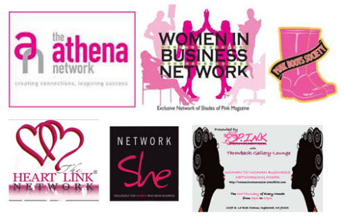
Business Branding - Some of the women's networking groups favouring cold blue magenta pink | Images - The Athena Network, Women in Business Network, Pink Boots Society, The Heart Link Network, Network She, The P.I.N.K foundation
pink symbolises women’s causes
Looking at the main positive qualities of pink being feminine love, nurture and caring it is no surprise pink is colour the majority of women’s charities use, especially when it comes to breast cancer charities.

Business Branding - Pink Ribbon International, just one example of women's charities using pink | Image: Pink Ribbon International
brand analysis
If you would like to know if pink is the right colour for your business brand and just as important the exact tone of pink, then why not see if a brand colour analysis is right for you. My clients find when they get their branding colours right, they really get how it represents their brand’s personality and how the right tone will increase brand recognition, attracting their target clientele and lead to increased sales.
How do you respond to a brand that uses pink as their primary brand colour? How does it make you feel?
To find out more about the effects colour has on your brand download my free e-book 7 mistakes most business owners make with their branding colours.
If you enjoyed reading this article you may also be interested in other articles relating to colour in business branding.
Images:
Peggy Porschen Cakes
Dell, Blackberry, Stanley and T Mobile.
Women’s networking groups: The Athena Network, Women in Business Network, Pink Boots Society, The Heart Link Network, Network She, The P.I.N.K foundation



Hi Karen,
It’s very interesting to consider that pink communicates certain characteristics that we may not be living up to with our brand, like subliminal promises that we might not be keeping. It is a great reminder that we need to be congruent with our brand and maybe we do need to consult a brand colour analysist to make sure were projecting the right message. Thanks for this.
Hi Felicity,
You’re spot on. Being congruent is key.
Lovely strong article about the colour pink in business branding, Karen. Thanks for explaining the meaning of the different tones of pink and what they convey. I also like how you describe the use of another colour with it.
With your knowledge of colour psychology I know you will be creating many successful brands in the future.
Charlene
Hi Charlene,
Great you found this of interest. You’re spot on, it’s very much about the tone and the colour combination. Any combination can give a different psychological meaning.
Another fascinating blog post Karen, I hadn’t thought of the negative side of pink especially the cold blue magenta. Definitely food for thought!
Hi Nicola,
Every colour has negative characteristics. You’ll want to make sure the tone of colour is being used in a positive way.
When my daughter was born, I dressed her in sugar sweet pink all the time; on the basis that I feel it is for only very little girls. On that basis, being all grown up, I am not usually drawn to pink but for some reason, Peggy Porschen looks wall lickably inviting! I love the use of sophisticated black with it, because it reminds me of Agent Provocateur’s branding, which is definitely grown-up and which I am most definitely a fan.