
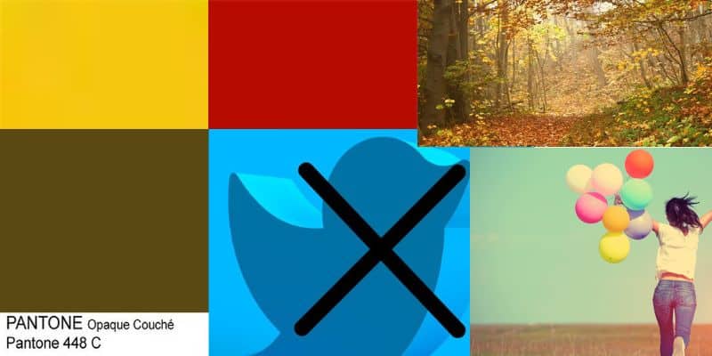
Top 5 most read articles for 2023

Karen Haller
With 2023 drawing to a close, I thought I’d take a peek at which articles were the most read this year. While last year they all related to the colour red, this year it’s an eclectic mix from how colour can bring joy, the rise of nature-led trends, the ‘world’s’ ugliest colour to Twitter’s rebrand and why red and yellow is popular with the fast food industry.
So here are the top five most read articles for 2023.
Going from 5 to 1, they are…
Number 5. Why colour has the power to bring us joy

Have you ever associated colour with joy? Have you ever noticed that certain shapes, patterns and design styles make you feel happier than others? This is the subject of a fantastic Ted2018 talk Where joy hides and how to find it by Ingrid Fetell Lee.
In this article I share how this can be achieved through employing Applied Colour & Design Psychology in your business for your clients. You can read the article in full here.
Number 4. Is this really the world’s ugliest colour?
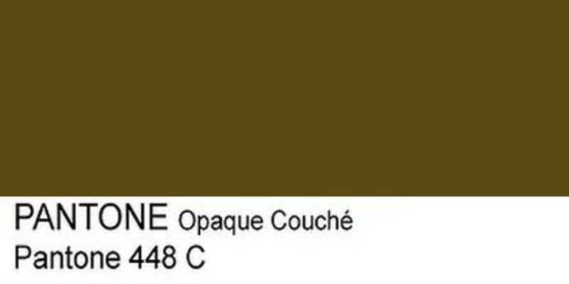
Back in 2016 Opaque Couche, otherwise known as Pantone 448 C won the ‘ugliest’ colour crown after Australian research agency GfK Bluemoon came up with the colour in response to the Australian government’s plain cigarette packaging policy. It might be the ‘world’s ugliest’ colour but it’s doing its job beautifully. You can read the article in full here where I share why.
Number 3. Why Twitter’s rebrand has alienated the market

If you use Twitter you would have seen the rebrand earlier this year go from the happy, chirpy, chatty light blue bird logo to an oppressive, dominating black with a hard X icon.
Why might Elon Musk have done this? I share my thoughts on this and more in the article where you can read in full over here.
Number 2. Three nature-led trends worth investing in

Have you noticed that your clients are wanting timeless designs but they no longer want the typical black and white, grey or muted tonal schemes that has defined timeless designs up until now.
In this article I offer up an alternative solution. And that is nature-led design. You can read the article in full here.
Number 1. Branding – why red & yellow is used by the fast food industry

Coming in again at number 1 is why red & yellow is used by so many in the fast food industry. In this article I share why this isn’t by accident. Why the feelings this combination of colours emits and the behaviours it elicits is perfect for their target market. You can read the article in full here.
Wishing you a colourful day!
Karenx


