
Is this really the world’s ugliest colour?

Karen Haller

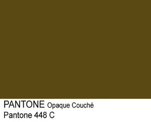
Back in 2016 Opaque Couche, otherwise known as Pantone 448 C, won the ‘ugliest’ colour crown after Australian research agency GfK Bluemoon came up with the colour in response to the Australian government’s plain cigarette packaging policy.
Think brand colours have no influence?
The Australian government had put a ban in place preventing companies from displaying their distinctive brand colours on the cigarette packets with the direct aim of discouraging people, especially ‘the young’, from smoking and they were seeking a colour that would be a ‘turn-off’ for smokers.
In the research (commissioned back in 2012), GfK Bluemoon collected feedback from 1,000 smokers to find a colour that was the antithesis of aspirational, attractive branding and Pantone 448 C Opaque Couche came out the winner.
The results from the first comprehensive study since using the plain packaging found increasing numbers of smokers quitting and it was less appealing to younger people.
The study and the results were considered so successful that UK, Ireland and France quickly followed suit by using this colour in their own plain cigarette packaging trials.
Colour psychology… behind the scenes
The aim of branding colours is to elicit positive buying behaviours by connecting to the emotion of the customer, attracting them to the point of motivating them to buy their product or service.
In this case, the researchers were asked to do the exact opposite – to strip away the positive emotional connection smokers had with their favourite tobacco brand and find a colour that would repel them from buying the product.
This must be a marketing first!
Think about that for a moment. A colour designed to make people not want to buy.
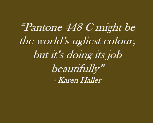
And that’s how Pantone 448 C, became the world’s ugliest colour.
So what’s the psychology behind the world’s ugliest colour?
In a nutshell, this specific green/brown hue communicates stagnation, decay, rot and ultimately death in its negative psychological traits. This colour like most colours, also has positive psychological traits but that’s for another time.
Colour and Context
What must be remembered here, we’re not looking at the colour in isolation, but in the context in which the colour is being used. By connecting smokers to the negative emotions of this colour, the aim is to use it as a buying deterrent.
Of course this won’t have the desired impact on everyone – colour doesn’t work that way, but the aim is to have this effect on the maximum number of tobacco consumers (and would be consumers) as possible.
Firstly, I should say here I’m not a smoker. When I look at this colour I like it, however when I think about it in terms of smoking, I can almost taste it – it’s like rotting slime.
As someone who sees colour has its place in the right context, I think it’s a bit harsh to call any colour ugly, but the way this one is being used, it certainly made a great headline grabber. The media certainly loved it as I found myself being interviewed by journalists and radio stations back in June 2016 when the research stats were ‘hot off the press’ news.
How certain are you that your brand colours aren’t ‘ugly’ to your ideal customers?
Unfortunately, it happens more often than you might expect. You love your brand and your brand colours. You love what you have to offer and hope your ideal customers feel the same.
But are your brand colours sending out the right emotive message on the subconscious level?
And does that message match the words (logic) your brand is giving on the conscious level?
Get this alignment right and it will attract your ideal customers.
If the emotion (subconscious) and the logic (conscious) aren’t in alignment, then it’s likely your ideal customer is going to be confused.
And we know that a confused mind doesn’t buy.
The emotional impact colour has in influencing buying behaviour is one of the most underrated, misunderstood and overlooked marketing tools that you have at your disposal.
Why not find out for sure?
Are you interested in finding out more about what makes a colour sell?
Ultimately, any colour will sell, but the right colour or palette of colours for your target market will sell better.
It’s all about understanding what colours appeal to your audience and having the colours speak the right emotional language that triggers those all-important buying responses. If you’re unsure about what colours will sell best for your target market, drop me an email and we can have a chat.
Colourfully yours,
Karenx
Originally published June 2016
Updated May 2025


This made me smile Karen, as it reminds me of a certain production made by my babies all those years ago – I couldn’t think of a more polite way to put it!
Hi Tanya, I’ve had this very comment from quite a number of parents 😉