
Top 5 most read articles for 2022

Karen Haller
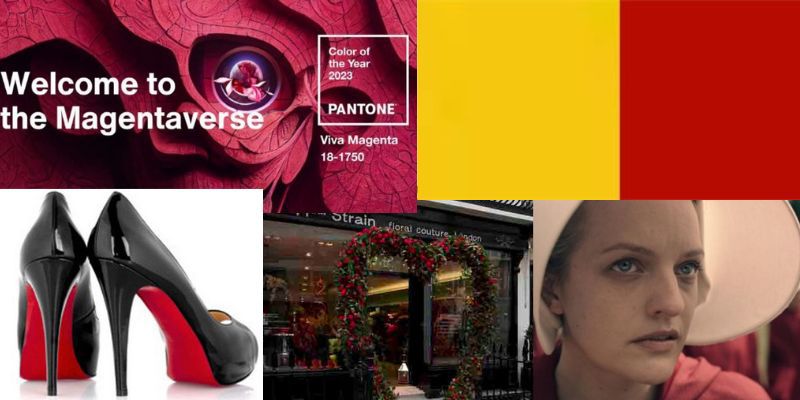
With 2022 drawing to a close, I thought I’d take a peek at which articles were the most read this year. Interestingly, there is a theme here – they all relate to the colour red.
So here are the top five most read articles for 2022.
Going from 5 to 1, they are…
Number 5. The meaning of red in the Handmaids tale
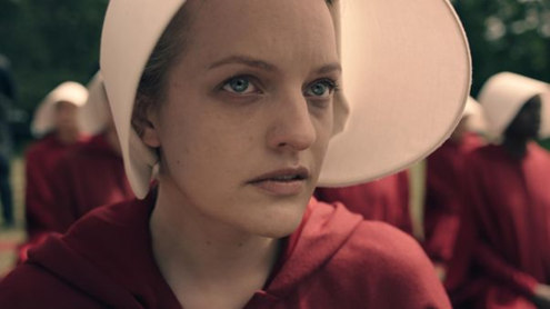
The hit TV series The Handmaid’s Tale, set within a dystopian society (which can be an uncomfortable watch at times) makes great use of colour to back up on the subconscious level, what we are seeing and hearing on the conscious level.
And from a professional perspective, what I found particularly interesting is their use of the colour red to fully immerse and engage us emotionally.
You can read the article in full here.
Number 4. Valentine’s day… what is the colour of love?
Red has come to symbolise ‘I love you’ and this is nowhere more evident than on Valentine’s Day. However red isn’t the only colour that expresses love. In this article I also share how other colours say ‘I love you’ in ways that are completely different to red.
You can read the article in full here.
Number 3. Personal branding – what statement are you making wearing red & black?
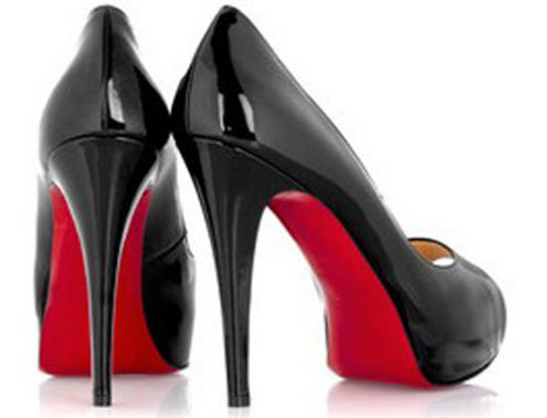
See a pair of stilettos with a red sole and you’re likely to instantly think Christian Louboutin. In this article I share the psychology behind red and when red is combined with black. I also chat to someone who explains why she loves wearing her Louboutin’s and how they make her feel.
You can read the article in full here.
Number 2. What do we think about Pantone’s Viva Magenta?
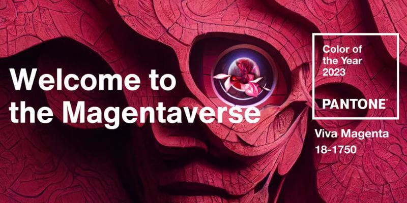
Pantone have released their Colour of the year for 2023 – Viva Magenta, which they describe is “a new animated red” , but magenta as a colour is pink, right? In this article I look at the psychology of magenta and colour naming. I also give my prediction on who is likely to pick up Viva Magenta and make it their ‘gateway into pink’.
You can read the article in full here.
Number 1. Branding – why red & yellow is used by the fast food industry

When you think of red and yellow do any brands come to mind? I’m guessing you thought of a fast food brand. That’s because they predominantly used red and yellow. In this article I share why this isn’t by accident and why the feelings this combination of colours emits is perfect for their target market.
You can read the article in full here.
If you would like to learn about more about using colour in design then download my free e-book, The 10 Myths that Limit You using Colour Effectively.
Wishing you a colourful day!
Karenx


