
What do we think about Pantone’s Viva Magenta?

Karen Haller
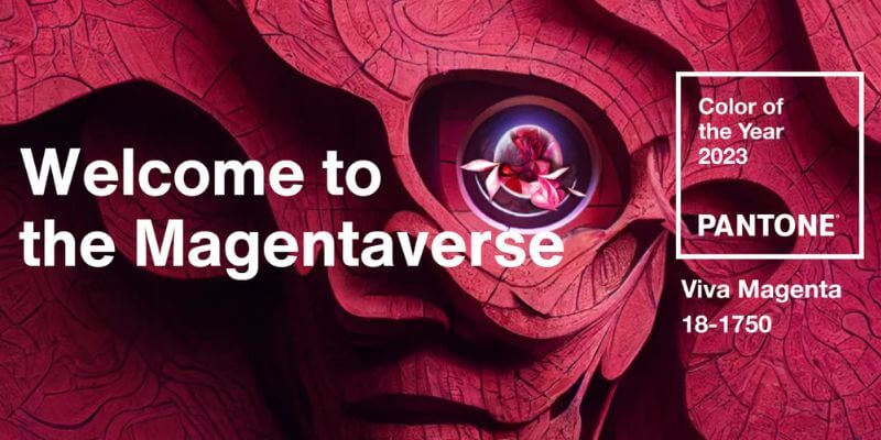
Pantone have released their Colour of the year for 2023. It’s called Viva Magenta but more about that colour name later.
In their official release they begin by welcoming us to the Magentaverse (yes, their play on the Metaverse.)
And then they go onto say…
“Viva Magenta 18-1750 vibrates with vim and vigour. It is a shade rooted in nature descending from the red family and expressive of a new signal of strength. Viva Magenta is brave and fearless, and a pulsating colour whose exuberance promotes a joyous and optimistic celebration, writing a new narrative.
It’s powerful and empowering. It is a new animated red that revels in pure joy, encouraging experimentation and self-expression without restraint, an electrifying, and a boundaryless shade that is manifesting as a stand-out statement. Viva Magenta welcomes anyone and everyone with the same verve for life and rebellious spirit. It is a colour that is audacious, full of wit and inclusive of all.”
Are you confused yet? You’re not alone.
Who is Colour of the Year for?
I do wonder why colour forecast companies shoehorn everything into their marketing description to the point where they are tying themselves in ‘adjective’ knots.
I’ve heard from an industry insider it’s written in such flowery language to build up the excitement and momentum for the colour of the year because this colour has to stand out from all others!
Writing the colour of the year description is no easy task especially when trying to get the attention of many audiences. There’s the manufacturers and the brands who are looking to sell their products, the designers (such as interior designers, stylists etc) who are likely to be specifying it to their clients and the consumer.
According to Pantone and most companies who have a Colour of the Year, the aim (at a very high level) is to capture the mood, the feeling of what is happening in society, and distil this down into a colour that encapsulates this for the consumers, even before they know it themselves. It’s also a powerful marketing tool for manufacturers and brands to use on their consumer products with one goal in mind – that it will sell.
Based on this intention, why do Pantone shared such a complicated ‘adjective heavy’ and at times contradictory marketing message? Why have they shoehorn everything into the description to the point where the reader can get lost?
The real litmus test of any Colour of the Year is whether the consumer resonates and connects with the colour, and buys it.
So, let’s look at this colour.
VivaMagenta – is it red or pink?
Pantone says VivaMagenta “is a new animated red” but Magenta as a colour is pink, right?
I think Pantone has gone and picked another one of those ‘which is it colours?’. Remember last year’s Ver Peri – is it blue or is it purple? It was a great marketing coup as it got so many people discussing it. Why not do it again!
With this question in mind, I ran a poll on my Instagram stories, and it looks like the colour lovers of Instagram can’t decide either with pink just ahead of red at 57% to 43%.
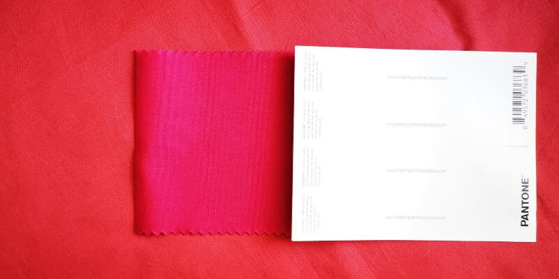
The tricky part is looking at colours on a screen is always going to influence what we see because of how the screen is calibrated (the colour temperature). It’s the age-old golden rule, to always classify a colour in real life. It’s something I recommend to my colour & design students.
So with that in mind, Pantone kindly sent me the colour so that I could see it in real life. I’ve placed it with a red for you to see. To my eye, Viva Magenta is definitely a cool, blue-based pink. And yes, the irony isn’t lost on me here that you looking at it on a computer screen!
Colour Psychology take on Magenta
This colour is definitely not for the fainthearted. It expresses itself assertively. This colour is going to get you noticed.
When Katrina Burroughs from The Times contacted me recently asking for my thoughts on this colour for her Times Online ‘Why magenta is the colour of 2023’, I said “When it comes to colour psychology, the blue-based magenta is nothing like the soft pink that invites ‘hugs and cuddles’. It exudes the bolder, feistier side of pink, asserting its independence saying, ‘I’m no pushover’.”
I’ve been charting our relationship with pink for over a decade, and I’ve noticed many women have an uneasy relationship with the softer pinks. My prediction is that Viva Magenta will be their gateway into pink.
“My prediction is that Viva Magenta will be their gateway into pink.”
I was chatting to Martha Roberts of The Colour File, and she asked me if I would be using this colour. My reply, “Personally, I couldn’t live with it or wear it. It’s too hard and intense for me (I’m a soft pink girl). But I could eat it!”
Whatever your personal or professional response to the colour of the year, there are many pieces of the jigsaw that have to fall into place in order for a colour forecast to become a colour trend.
It needs to be picked up by manufacturers, brands, the designer industry and consumers in order for it to become the colour of the year.
And that is yet to be seen. We’ll know that in six to 12 months, just in time for the next Colour of the Year to be announced!
Are you fascinated or curious about colour trends? Then you’ll want to know about my Everything You Have Ever Wanted to Know about Colour Trends online course. You can join the wait list here.
Colourfully yours,
Karen
If you would like to check out the colour for yourself, you can purchase your own sample of Viva Magenta over here. I am in no way affiliated with Pantone.
Sources:
https://www.pantone.com/color-of-the-year-2023
https://www.thetimes.co.uk/article/why-magenta-is-the-colour-of-2023-gpvcl0zqg
https://www.pantone.com/color-of-the-year-2023-collaborations


