business interiors – the colour purple. How to use your brand colour in the workplace

Karen Haller
When it comes to your client facing areas in your office, you will want to create an interior that projects your brand’s personality and message. To not do this you will be missing out on an important marketing opportunity and it could negatively affect your brand.
In this example I’m looking at Yahoo! whose primary brand colour is purple. Does Yahoo! embody the psychological qualities of purple – do they see themselves as a luxury, high quality brand? It would be interesting to find out why they choose this colour.
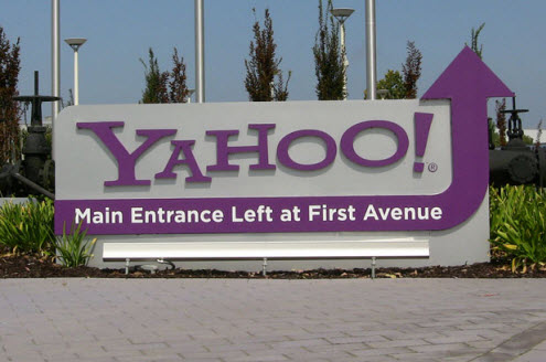
As you can see Yahoo! doesn’t leave any doubt as to who they are. Right from the moment you see their brand logo and colour at their driveway entrance.
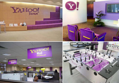
In the Japan office they use their branding colours not only in their client facing reception areas, they have also decided to use it in the back office areas too. This leaves the staff in no doubt who they are working for whilst further instilling the brand’s values on an unconscious level . There’s even a branded pool table.
It appears from these images a variety purple tones are being used. “Having a consistent brand colour palette will create long lasting brand colour recognition clues that impacts your customers on an unconscious level. You could even inadvertently find you are projecting a completely different set of brand values from those you want potential customers to associate with your business.” – extract from ‘7 Most Common Mistakes Business Owners Make with Their Branding Colours’.
home office
If you want to create an atmosphere of tranquillity, where you can have a workspace that allows for introspection and quiet contemplation, then consider an injection of purple. There are many variations of purple so pick one that resonates with you.
To discover the positive and negative psychological qualities of the colour purple read my blog post colour psychology … the meaning of purple.
Does your business have the personality to carry off purple?
Get your copy of ‘7 Most Common Mistakes Business Owners Make with Their Branding Colours’.
Image credit: Yahoo! driveway image, Yahoo! reception area, Yahoo! office area, Houzz.com and Picsdecor.com.
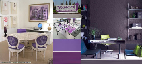
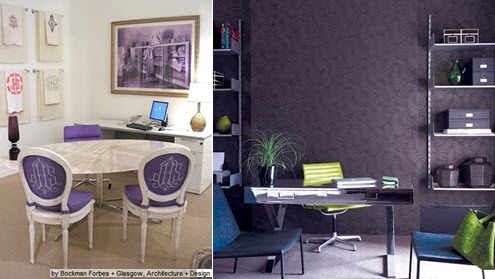


It’s interesting to see how the two different purples have totally different effects. Also, it seems to me that Yahoo’s purple doesn’t really suit their brand – they are definitely not luxury!
Hi Tamsin,
You’re right. It’s the psychological properties that you’re picking up. It would be interesting to know more about the Yahoo! brand personality to see how they came to pick purple. It may have been a cultural or symbolic reason.
Great post Karen. And the ’7 Most Common Mistakes Business Owners Make with Their Branding Colours’ is awesome. Thoroughly recommend it for anyone want to understand the dos and donts for colour in their business…
Hi Laura,
Thanks for the feedback. Pleased you found my e-book helpful.
Great post on Yahoo! and purple. Years ago I knew the Yahoo! Marketing Director in Oz and she planted her garden in Yahoo! brand colours – how is that for engagement?
Hi Wendy, that really is taking brand loyalty to a whole new level!
I love adding colour through feature walls – especially as there are so many beautiful wallpapers to choose from, including having your own images printed onto wallpaper – could be good for reinforcing the branding issue!
A feature wall is a great idea and I love your idea of printing images, say your logo as this would definitely reinforce the brand message.