business interiors – how businesses use brown

Karen Haller
Brown is often seen as dull, lifeless and even boring. Granted given these are some of the negative psychological traits of brown. This article aims to show there is a positive side to using brown – showing how a variety of brands from very different industries are using brown in their business interiors to communicate their brand message.
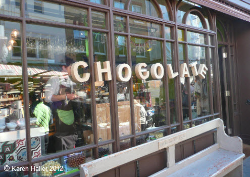
It is no surprise to find one line of business that is literally dripping in their use of brown – you guessed it – chocolate shops. Most commonly used tone is one we have come to call warm dark chocolate brown. If you’re a chocolate lover you’ll find yourself already salivating even before you’ve entered the store …
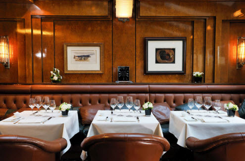
The salon in the Hôtel de Vigny, Paris uses brown to convey a feeling of tradition, old world charm and understated refinement. This is accentuated through the use of natural materials of wood and leather. Here you know you can be comfortable and relaxed. You certainly won’t be rushed in and out. You may find yourself spending longer here than you intended…
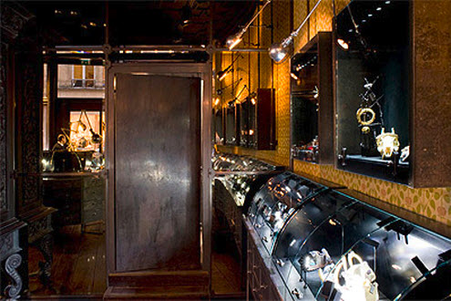
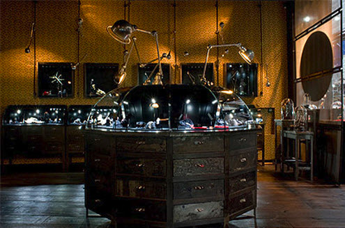
In this luxury jewellery store interior located in Paris, the designers created a neogothic interior style by using various tones of brown, from the aged textured wallpaper, antique wood furniture and aged metals. Mixed with gold it certainly gives this interior a luxurious, sophisticated feel. Lighting is used beautifully to showcase the exquisite hand-crafted pieces.
How do you respond to a brand that uses brown as their primary brand colour? How does it make you feel?
To find out more about the effects colour has on your brand download my free e-book 7 mistakes most business owners make with their branding colours.
You can read other articles on the colour brown.
Images:
karen haller, jjwhotels.com and mindfuldesignconsulting.com.


Brown suggests old world elegance, reliability and excellent service.
I think brown went out of fashion for a while but I although brown was associated with a lack of style from the seventies onwards, it is now enjoying a resurgence. Perhaps in these times of uncertainty we go back more traditional values. But industry still moves on apace. The sight of a shiny new chocolate brown mini is a delight to the eye.
Totally agree with you Tanya. Perhaps in the 70’s it was the tone of brown used and which colours where chosen to accompany that tone. Different tones of the same colour can give very different messages and different messages again depending on the tone of colour it is paired with.
Yes, I agree. My least favourite tone is rust, which seemed to be everywhere back then. The only place it is perfect is autumn leaves in bright sunshine.
Very clever solution..Thanks for sharing this idea..I ll definitely try it
Hi,
Pleased this post is of help to you incorporating browns into your schemes.
Karenx