business branding… evolution or revolution

Karen Haller
Have you ever found yourself looking at your business branding and thinking it’s time for an overhaul, a reassessment or a refresh? Your business could just be in evolution or revolution mode.
A business brand is a living entity. As it evolves and matures over time you’ll find yourself going through phases of reassessment to ensure your business remains true, articulating its authentic personality and values in alignment for the products and/or services it stands for.
Brand evolution is when you are looking to make small, incremental changes, tweaks to your current business branding. This option is often recommended when your brand has a strong position in the marketplace and you want to keep up with a growing or developing market.
Brand revolution, on the other hand, is usually recommended if your customer base / target market is in decline, you aren’t attracting your ideal clients or your brand is no longer standing out from your competitors – there’s no point of difference.
Even the Big Brands Do it
When we look at the big brands we usually only remember their current visual brand identity (the colours, logo, font type). Yet it’s really fascinating to see the evolutionary changes and for some quite remarkable revolutionary changes they have gone through over the years.
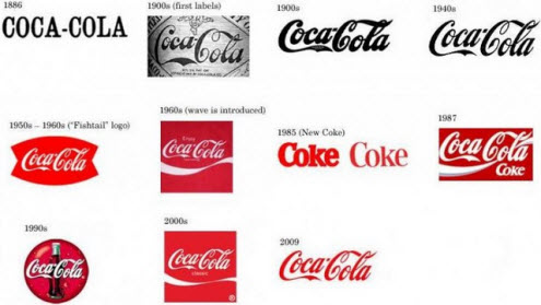
Coca-Cola have been around since the 1880’s but it was only in 1950 they took on their distinctive red – major brand colour revolution here.
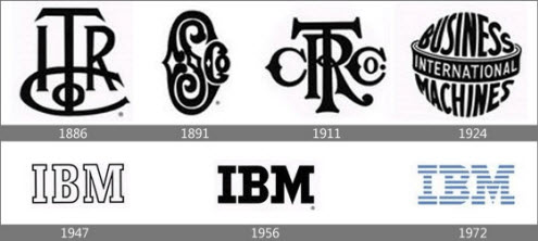
IBM is famously known as ‘Big Blue’. When they started back in 1800’s their brand colour was black and their logo unrecognisable from what it is today. It’s hard to believe they only changed to blue in 1972. This is a brand that definitely went through a revolutionary change.
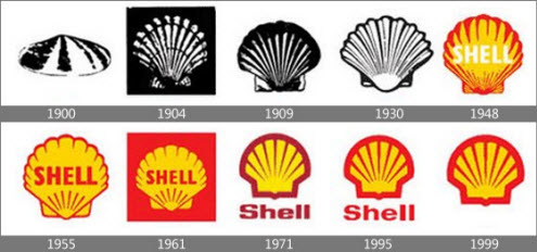
Shell’s brand identity has been going through an evolutionary change since 1900 evolving slowly through around nine changes to what we see to today. So strongly do we associate the brand colours and shape they no longer need to use their company name.
Gap is famous for going through a revolutionary change costing them millions only to then switch back due to the major backlash from its loyal customer base. From the reports the new look branding was meant to herald a new era of “modern, sexy cool” fashion. Mark Choueke, editor of Marketing Week, said: “Gap stands for youth, vitality and edge but this looks like the logo of an IT firm.” [1]
So how can you do this?
When I work with business owners I always recommend we start by carrying out a full brand analysis (Brand Personality Colour & Design Psychology Analysis). That way you are crystal clear on your business brand identity and it’s at this point you’ll know if the brand is in need of an evolutionary or a revolutionary change.
Think of this as having a brand baseline, a solid brand foundation from which every decision for your business will stem from; from your logo design, brand colours, brand strategy, through to the staff you hire and your customer service processes to name just a few.
Start with a full brand analysis. At this stage you’ll know if your business brand is in evolutionary or revolutionary phase. Then review all your brand elements, for example:
- Logo design style
- Brand colours
- Font style
- Copy
- Supporting colours for website, literature etc
- Imagery
- Strapline
- Store / office interiors
- Brand Strategy
- Customer service processes
And you’ll want to make sure all your brand elements are in alignment with the business brand’s identity (personality and values).
Now I’m not saying you have to spend millions like the big brands, but it does show how seriously they take their brand identity to be willing to spend enormous sums of money to get it right. They know the key to business success is to engage with their customers’ emotions. You need to think about how buying from you is going to make them feel.
Communicating through colour
As a business owner how much thought have you put into the tone and combination of colours that represent your business brand? Do you know what they are actually saying?
Surprisingly, most business owners use colour as mere decoration or as an afterthought. Instead think of colour as a subliminal language, another way to communicate and to attract your ideal clients.
Used to its full effect, your branding colours will give you the competitive edge, elicit the right emotional response from your prospects, and significantly increase your sales.
What do your business branding colours represent? What does it mean for your business brand identity?
If you would like to understand how you can make your business brand colours work for you, check out my business branding colour.
You can download her free e-book 7 mistakes most business owners make with their branding colours over at https://www.karenhaller.co.uk/freebook7mistakes.htm
Source:
[1] http://www.mirror.co.uk/money/city-news/gap-forced-to-axe-rebrand-after-253905


