
Why is Biophilic design in a ‘green’ rut

Karen Haller
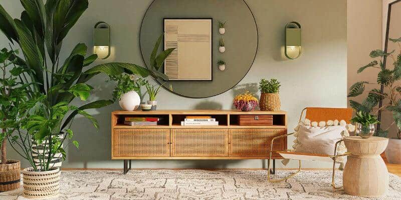
If you were to look up biophilic design or at the many interiors that follow biophilic design principles, it’s likely you’ll be met with a sea of green, wood and green plants.
I’ve been speaking to lots of designers and they’re all saying they are noticing this and asking why are we just limiting ourselves to those colours?
What they have said to me is that they are beginning to find biophilic design dull and boring because they feel so limited in their colour choices. They believe they can only use green and wood for it to be identified as a biophilic interior.
It seems that green and wood has become the shorthand for biophilic design for interiors.
But nature in all of its colours is so much more than a cookie cutter solution and goes far beyond a quick fix.
What Biophilic Design is at its core
Biophilia isn’t just a colour or a material, it’s our innate human affinity for nature. It reflects our instinctual need to seek out and bond with nature for overall well-being and a sense of belonging.
Because we are nature. We are not separate from it. Even though society can lead us to believe that.
True biophilic design integrates natural elements, patterns, colours and processes into the built environment, fostering a harmonious and restorative connection between people and nature that can’t be achieved by just using green, pot plants and wood.
How did Biophilic Design become simplified to green and wood?
From a colour psychology perspective, I can see why these elements were chosen as the ‘poster children’ for biophilia.
On a very primitive level, we are reassured by green, knowing where there is green we can find food and water – it equals life. We feel safe. Brown (wood) connects us to feelings of reliable, dependable, solid and again we feel safe.
We take great comfort in what is familiar to us and in the UK and many countries that is the woods, forest, fields and pastures which are primarily green and brown.
While green might be life to us, to humans, nature isn’t just green and wood. Nature uses all the colours.
And using just green in a biophilic palette is like a human living in just one emotional state.
Nature isn’t just one colour and humans don’t just live in one emotional state.
The natural world uses all of nature’s colours to communicate and we as human beings do that too. We use colour to express what we think, how we feel and how we respond to others and our environment.
How do we get Biophilic design out of the ‘green’ colour rut?
Now that Biophilic design is gaining momentum, it would be a major setback to nature-based design if designers thought green and wood was all it meant to create a biophilic design. And as a result, got bored and dismissed the style altogether.
Biophilic Design is an opportunity for us to reconnect as humans back to the natural world. We’re not separate from nature, so how can we as designers bridge this gap?
The answer is Applied Colour & Design Psychology. This is often the missing element when it comes to Biophilic Design. Because Applied Colour & Design Psychology gives you the tools to understand and implement designs that connect humans connect with nature and ultimately back to ourselves.
And when we understand this connection between nature, humans and how to bridge that gap, designers can consciously use the entire array of nature-based colours and design to solve the challenges of our clients whether that’s mental health, wellbeing, productivity or something else.
Here are the three key elements of Applied Colour & Design Psychology that allow us to do that:
1. Firstly, we assess how people want to think, feel and behave whether that’s in the home, workplace, or any environment, because if we are going to create spaces where people are going to thrive we need to know how people want to optimally think, feel and be in those spaces.
2. Next, we look at what colour palette and design style from Nature’s Harmonious System™ expresses that for the space. And each of these has a beautiful array of colours (that go beyond green and wood).
3. And finally, we identify which specific colours from the colour palette are going to deliver the desired positive thoughts, feelings and behaviours that our clients want in their space and environments so that they can feel safe, supported and thrive.
Want to broaden your Biophilic Design skills?
Whether we are aware of it or not, human beings have subconscious responses to colour and through Applied Colour & Design Psychology, which is a nature-based system and perfectly complements Biophilic Design, we can harness those responses to connect us back to nature.
If you want to use Biophilic Design as nature intended and steer away from the cookie cutter ‘green and wood’ and breathe colour into your designs, then Applied Colour & Design Psychology is the perfect tool for you to add to your design toolbox.
I teach everything you need to know inside my 6-month Advance Colour & Design Psychology Mentoring Programme.
Colourfully yours,
Karen
Image via Spacejoy on Unsplash.


