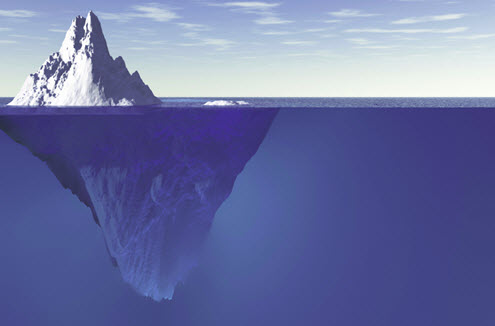
The colour wheel is just the tip of the iceberg

Karen Haller
Colour is one of those amazing phenomenons that’s fascinated man for centuries. So much so there’s specialist colour scientists, academics and researchers around the world coming up with amazing new colour theories and findings all the time.
Interestingly, the new ways of working with colour coming out of the ongoing research aren’t widely known within the design industries. It’s as if we’re stuck in a colour wheel rut and haven’t moved on. But this is definitely changing.
One of the biggest areas of research today that’s beginning to make ripples is around the psychology of colour – the study of the emotional connection we have to colour and how it can be used to influence people’s feelings, mood and, most importantly, behaviours.
Reawakening to the possibilities of colour
I’ve been studying and researching colour for the past 20 years and, thinking about it, I’d say it’s been within the past two years where I’ve noticed a real surge in curiosity from design professionals wanting to find out more about colour, using it in a way that has a more positive impact.
I often get design professionals asking me questions such as why their clients don’t like their colour choices even if it’s the colours they asked for, or why are they find themselves using the same colours in all their designs, or how to create a scheme were the colours aren’t jarring with each other.
All of this tells me that traditional colour theory of complementary, triadic, analogous colour schemes etc are no longer enough.
What’s sparked this renewed interest in colour?
I believe we are experiencing the rebound effect from a decade of designing and living in monotone white, grey or beige (if I had a dollar for every time someone asked me what’s wrong with white, I’d be a retired lady of leisure by now!).
Colour is becoming trendy again, yet something so fundamental to our lives is so much more than just a fashion choice.
And I sense these are some of reasons design professionals are looking for new ways and possibilities to use colour beyond mere decoration or an afterthought.
Colour creates an experience. It sparks emotion, changes a mood, influences behaviours.
Every moment of every day we are making choices about what to wear, eat, and buy; where to relax or spend our money; right down to how you take your morning coffee – we are making these choices, unconsciously, based on colour.
For me, this has always been a vital missing piece of the puzzle. Taking the traditional route I spent a year learning foundation colour theory, during this time I realised I really wanted to understand how did this all fit with people? We have emotional responses to colours, so how do we account for that when we’re creating with colour?
Going beyond aesthetics and trends
Seeing colour as multi-dimensional straight away opens up how it can be used. It changes colour from purely an aesthetically-pleasing add-on, to something that can be used to create a space that feels good to be in. Here’s the thing, whatever colour combinations you use will influence behaviours anyway, so why not pick colours that influence in a positive way?
Then we can purposefully use colour to create spaces that, for instance:
- Influence positive feeling and behaviours for example, a florist client of mine wanted colours in his boutique that gave his customers an amazing uplifting feeling as soon as they walked in the door ultimately putting them into a buying behaviour. Whilst the colours in the back office area enabled the staff to relax and decompress.
- Create a support environment. An example of this is when I worked with a vet who wanted the colours in his hospital to help create a calm, supportive environment knowing by calming the distressed pet owner, it helped calm their pet too.
- How we interact with ourselves and others for example, I’ve helped clients use colour to create the perfect home for them whether that’s playful and encouraging social communication, serene and elegant, quirky and eclectic or a sense of the dramatic.
Using colour psychology hand in hand with design enables you to consciously create colour schemes that you’re confident will have a positive effect for the people who are going to be using the space not just in the short term, but more importantly in the long term. Sometimes this is often forgotten because people are too focused on the “now factor”.
Understanding the psychology of colour opens up a whole new world of possibilities building on from the colour wheel. It gives you the knowledge to not just create a beautiful environment, but to create the perfect feeling, sensory experience.
Over to you
I’d love to hear from you on your thoughts and ideas in the comments section below.
And if your interested in discovering more about what lies beneath and you haven’t already downloaded your copy of my latest e-book, The 10 Myths that Limit You using Colour Effectively, here it is.
Until next time…
Karen x


Hi Karen
I’m excited I came across your website! It’s very informative and generous of you to share your experience with everyone. I’m really interested in working as a colour consultant. My experience has been in fashion design, then many years in graphic design and I’m currently studying surface design. Do you have any advice for the best way for me to get into Colour consulting? It would be much appreciated.
Kind regards
Clare
Hi Clare,
My apologies for missing your comment. I can see that you’re on my mailing list. The best way for you to get into colour consulting, if applied colour psychology is where you want to specialise is through my courses. Drop me an email and we can have a chat to see what’s best for you.
Karen 🙂