colour branding – tiffany blue increases brand recognition

Karen Haller
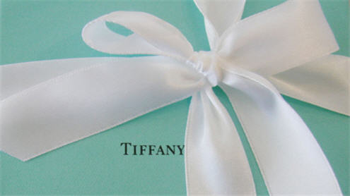
You see a turquoise box and even before you see the name, you know it’s from Tiffany & Co., the world renowned New York City jewellery company.
What woman wouldn’t go slightly giddy being presented with a blue box from Tiffany, knowing there will be an exquisitely beautiful gift inside? The classic Tiffany Blue Box® symbolises a company steeped in romance, luxury and quality.
So strong is their brand identity linked to this colour, Tiffany Blue is protected as a colour trademark by Tiffany & Co.
colour steeped in history
The famous blue, sometimes described as robin’s egg blue, may have been chosen because of the popularity of the turquoise gemstone in 19th century jewelry. Turquoise was also a favourite of Victorian brides who gave their attendants a dove-shaped brooch set with turquoise so that they would not forget the bride.
colour psychology
In colour psychology terms turquoise represents communication, creativity, it’s modern and forward thinking. The perfect colour for a pioneering brand such as Tiffany & Co.
colour protection
Tiffany Blue is a private custom colour produced by Pantone®, PMS reference number 1837. This number was given as it represents the year Tiffany & Co. was founded. As it’s a trademarked colour, it is not publicly available and you won’t find it printed in any of the Pantone® Matching System swatch books.
brand identity
No longer merely just a colour, this particular blue has made the Tiffany Blue Box® an international icon signifying the excellence of all Tiffany & Co. designs. They have been able to do this by maintaining consistent use of colour across all their communications – boxes, shopping bags, advertising and other promotional materials.
What do your business branding colours represent? What does it mean for your business brand identity?
Tiffany & Co.
Press release, Photo credit (low resolution image)


I once heard a quote: “Tiffanys don’t sell jewellery, they sell blue boxes”.
Their brand is so closely tied to this colour, that I’ve heard people even refer to it as ‘Tiffany blue’ sometimes. Incredible!
Thanks for sharing the history of this one – it’s really interesting.
That quote ‘they sell blue boxes’… Tiffany & Co. has a rule “The rule of the establishment is ironclad, never to allow a box bearing the name of the firm, to be taken out of the building except with an article which has been sold by them and for which they are responsible.” (Tiffany Press Release).
To have your company linked to a colour as in ‘Tiffany Blue’ is certainly great advertising for the brand.
It’s amazing how strong this colour association is. Even if someone says “the company with the little blue boxes” people know it’s Tiffany. I didn’t know they had trademarked the colour or that the colour is based on the year Tiffany was founded – it’s a great story! Definitely reminds people to consider carefully which colours they choose for their business, and if they can have a story behind it then that just helps solidify their brand’s story. And stories really help people to connect with brands. Thanks for this post and the research behind it Karen!
Hi Keren,
Yes, it is a great story, rather a romantic one. Other major companies have trademarked their specific hues so important is colour to their brand identity.
I am one of those who refers to the colour ‘Tiffany Blue’. I had no idea it was trademarked! Fascinating insight, thanks for sharing.
Hi Alicia,
Many major brands trademark their colours. I personally love Tiffany Blue, it’s a very pretty turqouise.
Fascinating, Karen, thanks for this. It’s interesting to hear that the colour represents creativity and communication – and we all know that when someone presents you with that Tiffany Blue bag they are saying, “You are very special to me.” I would like my brand colours to be communicating the same message to my clients. I hope they are.
Hi Felicity,
Glad you enjoyed it. A brand who aligns its colours with its brand values and aims will be projecting its authentic self.
Wow! This is really cool. I had no idea about the 18th Century brides giving the dove broach gifts…
So what does this mean about our own brand colours Karen? Could you enlighten us as to which ones are the best to pick? Would we be better to avoid ones similar to popular or trade marked ones, or is any kind of recognition in the client’s/ prospect’s eye really important?
xx
Hi Laura,
When it comes to selecting brand colours, it’s the colour or combination of colours (from the same tonal colour family) that reflects the brand’s values, effectively reflecting the brand’s personality.
When it comes to colours to avoid, only those tones, tints or shades that have been trade marked which is usually referenced by a Pantone PMS number. There will be a similar colour available either side of that particular trade marked hue.
In regards to your last question, by identifying the brand’s authentic personality, then the colour/s that reflect that will truely resonate with the brand and its values.
Hope that’s of help x