business interiors – how to use red to create an impact

Karen Haller
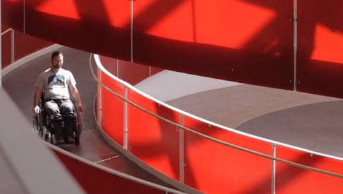
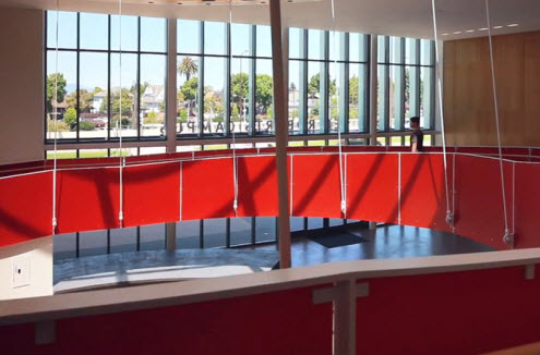
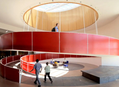
The Ed Roberts Campus in Berkeley, California is the first structure of its kind in US. A non-profit community centre for the independent living & disabled rights movement. The designer’s brief was to create an “eye-catching, functional ramp structure … while avoiding an “institutional” appearance”.
why red
Red is eye-catching! Red says ‘look at me’. It is the colour of energy. It encourages movement which is perfect for this space. It creates excitement, raising the energy levels and motivation.
I think you’ll agree they did a superb job in using red to create not only an instant visual impact but an eye-catching focal point for the entire building.
in the workplace
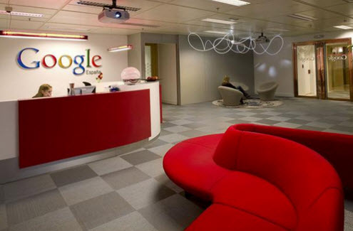
If red is your brand colour incorporating look at ways you can incorporate it into your client facing areas to subliminally reinforce brand awareness. And if it’s not, then using a touch of red can create an eye-catching, impact statement.
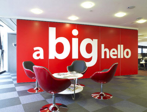
Using red in the reception area provides a clue this brand has a friendly, dynamic and vibrant personality.
home office
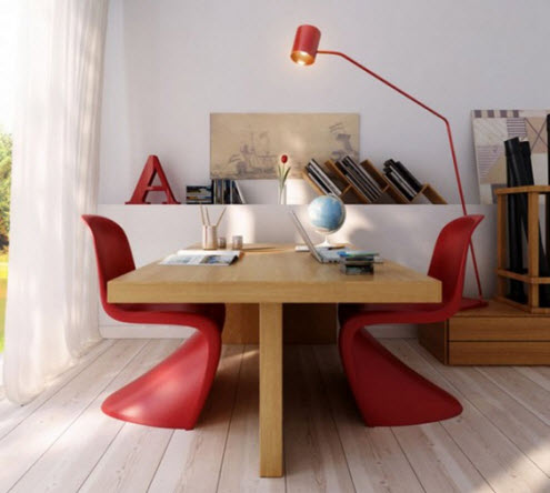
Sometimes working from home it’s challenging to keep the motivation, stamina going. A dash of red may be just the injection of colour you need. There are many variations of red so pick one that resonates with you.
To discover the positive and negative psychological qualities of the colour red read my blog post colour psychology … the meaning of red.
Does your business have the personality to carry off red?
Image Source: 3-form, interiormagz, homedesigninterior and rexohome


I love red! I have a shiny red desk…it matches the soles of my shoes when I put my feet up…
No doubt that red desk keeps your energy and stamina going throughout the day! Goes perfect with your Louboutin shoes! 😉
I have a red desk too Tanya! 🙂
Great example of red being used in the architecture of the building Karen.
Did I hear somewhere its good for bringing people into a building, so good to use in entrance halls?
Hi Laura,
Red is a good colour in say a high traffic area to get people moving such as in The Ed Roberts Campus in this blog post. The proportion of colour is very important otherwise the purpose is lost and it will be overpowering and the negative effects of the colour may be experienced.
Hi Karen,
Wow, thanks for shedding such great light on the subject of using red in offices and business interiors. I’m not usually a fan of red but I really like the subtle uses in the home office shown above. Mixing it with the natural wood is very appealing.
I will be adding little splashes of red to our home office for that next level of inspiration!
Charlene
Hi Charlene,
You only need a splash of red as it is such a high energy colour. That should be enough to lift your energy levels!
My partner already complains that I’m too proactive, but perhaps if I start using red in his spaces he’ll be able to keep up with me more!!
Hi Nicola,
After all… red is the colour representing masculinity, stamina and strength!
I LOVE red in interiors – we have it in our kitchen/dining room and in our lounge. I feel so ‘up’ when I go in, and now I know why. I love orange and purple as well – what do they mean?
Hi Wendy,
Red certainly gives the feeling of ‘up’, energised. On the other hand there is no respite…
In regards to your question on what orange and purple means, I’ve just happened to have written articles on the colour psychology of these two colours https://www.karenhaller.co.uk/blog/colour-psychology-%E2%80%A6-the-meaning-of-orange/ and https://www.karenhaller.co.uk/blog/colour-psychology-the-meaning-of-purple/
Enjoy!