business branding colour … meaning of red

Karen Haller
Brands whose personality projects the qualities of red are outgoing, lively and energetic. They definitely want to get noticed!
colour psychology
Positive qualities of red are warmth, excitement, stimulation, energy, strength, power, physical courage. On the negative side it can come across as aggressive, defiant and confrontational. Due to its high level of energy it can be overwhelming and tiring.
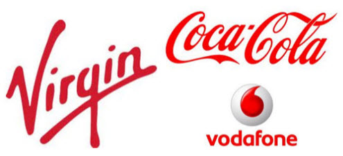
When you think of the Virgin group, this brand is not shy taking on the big established firms at their own game. You could say they almost have a defiant, rebellious streak. This is a brand full of stamina, energy and there is a buzz, excitement about what they are up to next.
Coca-Cola is all about the stamina, power and the energy boost their drink provides, making red the perfect colour choice. Vodafone has established itself as a powerful, strong leader in mobile technology.
brand analysis
If you would like to know if red is the right colour for your business brand, then why not see if a brand colour analysis is right for you. My clients find when they get their branding colours right, they really get how it represents their brand’s personality and how the right tone will increase brand recognition, attracting their target clientele and lead to increased sales.
How do you respond to a brand that uses red as their primary brand colour? How does it make you feel?


Hi Karen,
As someone who uses red in the branding for one my brands, it’s great to read that my intentions are being accurately represented in my choice of colour. That is the great thing about working with a good designer – they understand colour and how to interpret your brand vision. Thank you for reminding me that I’m on the right track!
Alexia
Great news Alexia that your branding colours reflect your business brand’s authentic personality.
I hadn’t realised that ‘red’ brands are going for that ‘high energy’ impression, but now that I read this article it makes perfect sense.
It’s interested to see how these brands all use the same colour in different ways, and for subtly different effects.
And if you notice the reds are different tones which in themselves reflect different brand personalities.
stamina and energy – that’s really interesting. I’d never thought of that before…
Just out of curiosity – why would something like lucozade opt for orange as a brand colour? Or is that for different reasons?
(The drink is orange isn’t it?)
Hi Laura,
Lucozade drink colour is orange. Without researching into the company, it could be colour association. Maybe they wanted the drink to mimic vitamins e.g. vitamin C and the colour became orange.