world’s most unusual hotels – pantone® hotel

Karen Haller
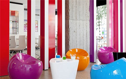
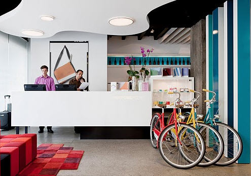
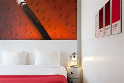
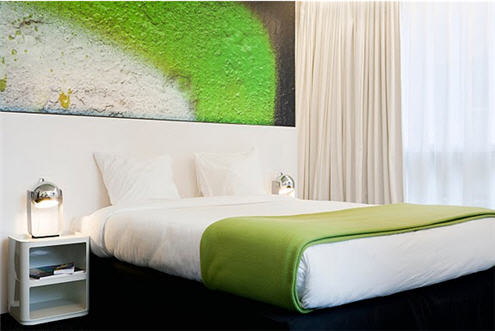
In the second of my world’s most unusual hotels series, I look at the Pantone® Hotel. The individuality and originality in this hotel is how PANTONE® have used their own colour matching system (which is recognised worldwide) to create a colourful experience.
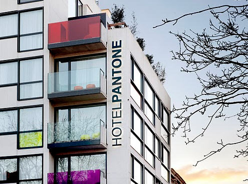
You’ll find the colourful Pantone Hotel® in Brussels, Belgium. From the splashes of colour on the hotel’s exterior, you know it’s going to be a colourful stay as each room has been designed using one of the many Pantone® colour palettes. Be ready for bursts of saturated colour at every turn!
If being surrounded by bursts of vivid, dynamic colour is your thing, then this hotel is for you.
All Photos permission and courtesy of the Pantone® Hotel. All images copyright © Photographer Sven Laurent.
Do you have a favourite hotel you’d like to share?


I love this hotel…. how refreshing! It makes a welcome change from the neutral palette we see in so many hotels now. Great blog post!
Hi Elle,
Those colours definitely give the feelings of refreshing and energised! Great there is choice from quiet, calm neutrals to lively and energetic!
Wow, what an amazing place, thanks so much for sharing this Karen – I never knew about it. A must for designers everywhere! Definitely something we can claim as a business expense!
It certainly is a cool idea! Sounds like there may be an excursion being planned…. 😉
Really enjoyed this blog, Karen! Lisa is right – this does make a refreshing change from the ‘please everybody’ palettes we have today. I would stay there in a heart beat.
Yes, and with each bedroom being comprising of a different colour palette you could choose the room depending on what mood you’re in.
Hi Karen, it’s a great find! I went to one of their opening events: we could wander through on each floor and then enjoyed cocktails on the roof. Not only is it a great budget design hotel, but they’ve incorporated the colour scheme per floor: from the stairwell door, through to the corridors and each room on the floor, every area uses white as a backdrop to highlight a unique Pantone colour. I loved how they used a stretched cloth ceiling to add a delicate glow of colour to the corridor!
Great blog! It was good to meet you at the colour talk 🙂
Hi Laura,
Thank you stopping by and providing us, that are yet to visit an insiders view. It’s a great concept.
I might need to make a business trip of it 😉