
Which 2024 Colour of the year speaks to you?

Karen Haller
Happy New Year!
What are you most looking forward to in 2024?
I’ve been reflecting on my wish for 2024 which is that we unite in supporting and helping each other. Creating a world where we are kind to ourselves, kind to others and kind to the planet. For me it’s a question of who do we want to be in the year ahead? How do we want to show up in the world?
There’s so much devastation, anger and division in the world on a human level just now so ultimately it’s about becoming the change we want to see in the world.
And interestingly, what is happening in the world on a human, environment, lifestyle level, as well as what’s happening politically and economically are all the things and more that trend forecasters are watching for. And based on what they see, they bring it all together to make predictions about future trends.
When it comes to trends like the Colour of the Year, companies like Pantone and the major paint companies do their own predictions which they have forecasted usually 18 months before.
So, let’s see what each Colour of the Year for 2024 is from Pantone and some of the major paint companies like Dulux, Sherwin-Williams, Dutch Boy and Behr.
And as you read through the list, keep an eye out for where the similarities are in how they described the colours.
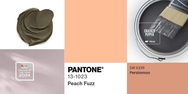
Dulux: Sweet Embrace™
Dulux have selected a very soft pink, that has a lot of grey in it. It’s barely-there pink. Marianne Shillingford, Creative Director Dulux UK and Ireland says when life is complex and we need to decompress and step back from the complexity of life to find quiet moments of calm, home is the perfect place to for us to unravel the tangle.
Sherwin-Williams: Persimmon

There’s no background explanation on their website why they choose this as their Colour of the Year. They do describe it as an earthy terracotta that is both calming and cheerful and they say it promotes positive relationships and conversation.
Pantone: Peach Fuzz
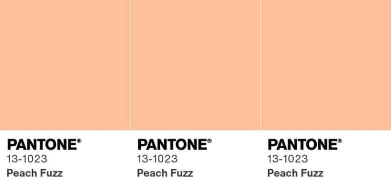
Pantone is defining 2024 with “Peach Fuzz”. They say picked this soft peach because for them it brings up feelings of peace and serenity. “We’re going through a lot of turmoil in our lives, and we have a need for a colour that’s nurturing,” says Pantone colour specialist Leatrice Eisman. “It’s a warm and cozy shade. And it’s very tactile. We feel that at a time like this, tactility is really important. To touch other people and gather them into our homes.”
The first three are all soft pink, peach colours. And it’s interesting how the next two companies have interpreted their forecasting data and come out with colours that couldn’t be more different.
Dutch Boy: Ironside
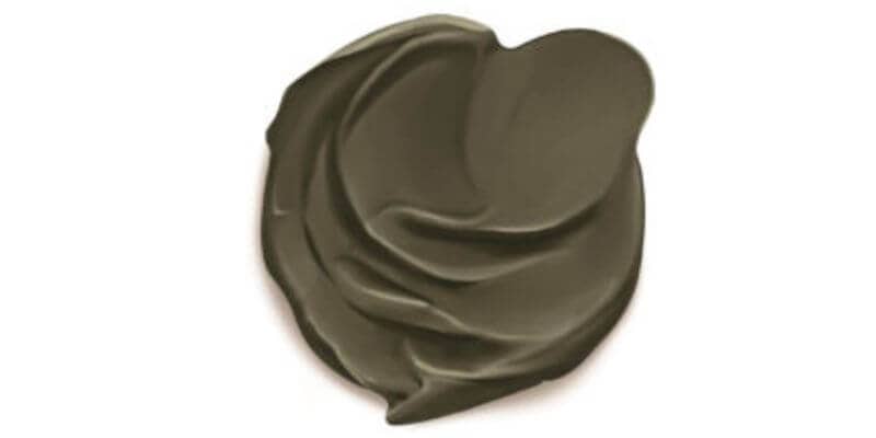
The brand describes the nature-inspired olive green colour, (which to me looks very much like an olive green with a lot of dark brown and grey added), “as a great one for anyone who seeks to make their home a “sanctuary for well-being.”
“Ironside is rooted in comfort and creates a space that is elegant and charming. As dark shades become more appreciated in the home, this deep olive is versatile in wide-open spaces or enclosed comfy places, reflecting well-being from all angles.”
Behr: Cracked Pepper
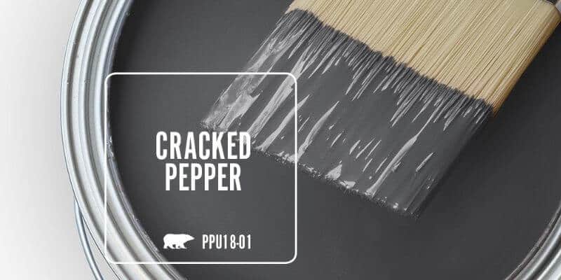
Behr went for “Cracked Pepper,” a soft black colour which they say evokes a sense of confidence and individuality that they want all of their customers to feel after completing a project. “We recognise the growing desire for using darker colours throughout spaces,” says Jodi Allen, the company’s global chief marketing officer.
So, there you have it, the main colours of the year. The common themes appear to be creating a safe sanctuary and comfort.
From a colour psychology perspective Sweet Embrace, Persimmon and Peach Fuzz center around creating a gentle, comforting environment, one of connection and togetherness. Creating a sanctuary that is gently supportive. There is light and hope here.
The darker Ironside and Cracked Pepper also give the feeling of being supported however this is done by creating a protective barrier, shielding from what’s going on in the outside world.
As you can see, both the softer, light colours and the darker colours create a safe sanctuary and feelings of being comforted, in two entirely different ways.
Which 2024 colour of the year speaks to you? Which do you feel is a reflection of what’s going on and which one do you feel will work best in your industry?
Are you, like me fascinated by trends forecasting? Do you ever wonder where they come from? Or what drives them? Or like many designers I’ve spoken to wonder how to use them once they have been released?
These are some of the common questions that inspired me to create a course I’m releasing at the end of this month called Everything You’ve Ever Wanted to Know About Colour Trends.
I wanted to produce something that could make colour trends stop feeling like the dark arts and start to be something you could consciously use in your design work (and discern when not to use a trend).
Click here to find out more about the Everything You’ve Ever Wanted to Know About Colour Trends course.
Colourfully yours,
Karen


I’m a big fan of Pantone’s Peach Fuzz. It has such an 80s nostalgic feeling for me. Thanks for sharing all the different varieties.
Hi Lavinia,
I know what you mean. It definitely has that ’80s vibe to it. Everything that’s old is new again 🙂