The Effects of Colour – Forbo Flooring Webinar

Karen Haller

When 1000 industry professionals show up to a webinar you know there’s something good going on. And that’s exactly how I felt after sharing the ‘webinar stage’ (despite it being midnight for me) with Pantone’s Carola Seybold hosted by Forbo Flooring systems to discuss The Effects of Colour in Interiors in April. Design professionals from around the world tuned in to hear Carola and I discuss the effects of colour on wellbeing in interiors.
The key take away I shared during this session was that design schemes should never start with colour (or design) and instead with behaviour.
If you would like to watch the webinar in full, then scroll to the bottom and hit play or you can keep reading if you would like to discover the 5 key points I shared in how colour can impact wellbeing in interior spaces and our environment.
why do we make decisions based on colour?
Up to 85% of shoppers place colour as the primary reason why they make a purchase, whether it’s a product, choosing a café or restaurant, or things for the home.
If we can see it, it will have a colour.
our emotional connections to colour
Colour makes us feel something. When we take in colour, we are having an emotional reaction. Not to just one colour but all of the colours around us within the space.
As logical human beings, we like to think we buy on rationale and logic. However, our purchasing decisions are based on an emotional need or an emotional desire. We are connecting emotionally to the colour first, before shape, words, materials or anything else.
the role of nature
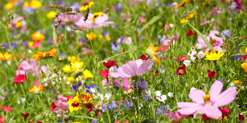
This instinctive response we feel, this connection we feel when we’re in a space comes from nature. Nature holds the key to the solution. We have a symbiotic relationship with nature, it’s where we and our ancestors come from. Nature goes beyond fads, fashion or trends.
This links nicely to behavioural colour and design psychology, as this methodology is based on nature. It connects human centred design with nature. It dovetails perfectly with other nature-based disciplines such as biophilic design and sensory marketing, which makes for sustainable and long life cycle design – futureproofing design.
People will want more than ever this sense of connection, of belonging and to be surrounded by things that feel familiar. I believe reconnecting and aligning ourselves back to nature is the future of design.
Colour is more than a mood and more than just a feeling – it influences behaviour. While we’re not able to see a mood or a feeling, it is possible to tell how someone reacts or responds to an interior space because of their behaviour. This is why there needs to be a shift towards starting the design process based on behaviour.
There is no doubt that colour can influence both positive and adverse behaviour, that’s why when looking at behaviour and the use of colour, it’s important that the focus is on achieving positive outcomes. Colour can affect wellbeing, where factors like air quality, light and sound can be measured, the effects of colour can be measured too – and that is the intention of behavioural colour and design psychology.
We are looking to create environments that influence positive behaviours for
positive change and positive outcomes.
behavioural triggers and motivators
I have developed a five-step Behavioural Design Framework which I use with my clients, and Step Two is about assessing behavioural triggers and motivators.
Most people think colour is implemented only for aesthetics, or perhaps to follow a trend – it is there for a visual effect and that is it. As we have learnt, we have an emotional connection to colour that triggers our behaviours, therefore when we’re using colour, we want to make sure that the right environment is created, whether for a home, office, hospital, department store, any interior space. This begins by finding out what the behaviours are that your client doesn’t want to see (triggers), as well as the behaviours that they do want to see (motivators) within that particular space. Once you have applied the colours into your scheme, it is possible to measure the behaviours of the users in that space when it is being used.
For example, in a restaurant, if your client wants fine dining and for everyone to be calm and quiet, appropriate colours can be used to influence and trigger people to know that this isn’t a fast-food joint and somewhere for them to run around.
In terms of motivators – what is working for your clients now? And what positive change do they want to see in the future?
This information will guide you, the interior designer, the architect, to choose the right colours down to the specific tints, tones and shades. It is also important to consider other factors such as colour saturation, whether they’re soothing or stimulating, proportion and placement; all of these will have an impact.
While a small proportion of a particular colour may encourage a particular behaviour, if increased, you could create an adverse side of those behaviours which you don’t want. Ultimately, the goal is to create a space that people will thrive in.
It is predicted by 2050, up to 70% of us will be living in urban environments. It used to be more rural, where people lived connected to nature, but this is set to change. We have a responsibility – not to make every house and indoor space wall to wall green, as every colour (except brilliant white) is present in nature – to create spaces that are familiar. Spaces that we feel comfortable, safe and connected in, environments in which we will thrive, and this is what I believe will be the future of design.
Are you looking to dive further into your professional colour career or dive further into the professional world of colour & design psychology? If you would like to find out more about my colour & design courses head over here or if you are interested in hiring me to work with alongside to understand behaviours and create a colour & design scheme that support positive wellbeing and positive change for workplace, business or the home then contact me on karen[at]karenhaller.co.uk.
Or if you’re looking to tip your toe into the world of colour and find out more about the effects of colour for your clients, then you can download my free e-book The 10 Myths that Limit You using Colour Effectively.
Colourfully yours,
Karen


