
London Olympic… how did they come up with the design and colour scheme?

Karen Haller
![]()
Have you seen the London Olympic brand logo and colours? They are pretty hard to miss. Love them or loathe them, they are really polarising public opinion. Even Lord Coe being quoted as saying “It won’t be to everybody’s taste immediately…”
So how did they come up with the design and colour scheme?
brand logo design
The brand, designed by Wolff Ollins, has been targeted at young people based on Lord Coe request to have the branding appeal to young people in the hope they would get involved.
Lord Coe stating the branding was “…to inspire everyone and reach out to young people around the world.”
They felt this was “very much to create energy… Lines reach out from the shape and angles of the Emblem to create a dynamic geometry”
And they interpretation of youth appeal is through a graffiti style mark. Is this really appealing to young people or just what the designers think they are?
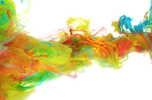
brand colours
The official website states “The four original colours of the London 2012 Olympic identity is pink, blue, green and orange. These colours were inspired by the worlds of media, communications and fashion. The colours were carefully chosen to communicate the spirit of the London 2012 Games: energetic, spirited, bright and youthful.”
It looks like they interpreted this by choosing a cold blue based tonal colour group, one that is intense, vibrant and bold, which go well with the edgy, modern, jagged design.
What I’m not clear on is how they came up with the actual colours based on the values they were given. They aren’t based on colour psychology, nor colour symbolism. It would seem they are based on the design team (personal) associating it with media, communications and fashion.
International Olympic Committee president Jacques Rogge has been quoted as saying “This is a truly innovative brand logo that graphically captures the essence of the London 2012 Olympic Games – namely to inspire young people around the world through sport and the Olympic values. Each edition of the Olympic Games brings its own flavour and touch to what is now well over a century of modern Olympic history; the brand launched today by London 2012 is, I believe, an early indication of the dynamism, modernity and inclusiveness with which London 2012 will leave its Olympic mark.”
In their quest to be inclusive to young people have they alienated everyone else? If being inclusive is one of their values, have they achieved this? If one of Lord Coe’s key missions was to inspire everyone… how inspired do you feel?
Image: Attitudedesign.co.uk
Source: London2012.com, Olympiclogodispute.blog.co.uk, News.bbc.co.uk


I am all for innovation and cutting edge design but the London Olympics logo is the biggest mishmash of nonsense I have seen for a long time. It is far too fussy and cluttered and jars my senses every time I see it. Surely we could have produced something better than this! I dislike it intensely !!!!!
Hi Steve,
You are not alone in your views on this. It has really polarised the nation. Given London2012 was all about inspiring a generation, I’d be really interested to hear their findings on what the youth generation thought of the colour and design and whether it has inspired them.