
colour & design surgery – how your desktop screen colour can improve your mood

Karen Haller

This is part of the colour & design surgery series, answering questions from clients and readers.
Question: “I run a website design company. What colours should we have our desktop pictures set to when we want to feel energised, calm, brave and balanced?” – Keren Lerner, Top Left Design
Answer:
Great question Keren. I’m sure most of us are finding ourselves sat more and more in front of computers, some all day long, constantly taking in information. If it’s not at our desk, it’s on the move with our laptops, iPads and other mobile devices.
Besides employing healthy ergonomic principles in creating a work/rest balance, the colours we choose for our desktop pictures can provide some support in helping us managing our mood and how we feel.
quick science bit
When we take in colour through the retina, the colour’s wavelength is converted into electrical impulses. These then pass to the hypothalamus within the brain which governs our hormones…our emotions and how we feel.
evoking feelings through colour
In general colour psychology terms, the colours that relate to the feelings of energy, calm, brave and balance are:
Energised – any colour that is vibrant and lively (intense colour)
Calm – soft green, blue, pink
Brave – *red
Balanced – green
special note: when using any colour with high chromatic intensity, be aware they will be stimulating. When looking at your screen, consider if this is what you want to be looking at. For example, a soft blue is mentally calming whereas an dark, intense blue is mentally stimulating. Traffic light red is physically stimulating, making you alert, whereas pink is physically soothing.
* the red wavelength always evokes a physical reaction. Using too much red for too long, especially on a computer screen can be physically tiring or over stimulating. Best used as an accent colour.
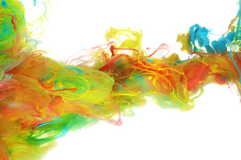
images
Alongside colour, other elements to consider are image, shape and visual texture that give the feeling, mood or sensation you want to evoke. That might be a beach scene, an energising sunrise or a soothing sunset, lust calm rainforest, a powerful waterfall… this will be unique to you, based on your personality.

points to consider:
1. Like in any colour application, if you find it no longer supports you, then simply change it.
2. Some people may prefer a single colour whilst others a combination of colours.
3. A colour that is relaxing to one person may not be to another, so find the tone, tint or shade that works for you.
4. Have several images and colours depending on how you want to feel at different times of the day. You may want an image with colours that energises you in the morning and during the late afternoon lag, or you may want to gently ease yourself into the day.

Looking further than the screen, also think about the colours of the workstation and the overall office. All has an effect on morale and productivity.
You may also be interested in reading my blog article on the tips for creating the ideal office environment.
If you have a colour or design question you’d like answered send me an email.


Hi Karen, thanks so much for focusing on our question, it’s really useful and I will be sure to share with the team so we can cultivate the desired moods during our working days using colour! Thanks so much! I am looking forward to you working with us on our company colours!
Hi Keren,
Thanks for the great question. I hope it’s of help to you and your great time. Interested to know over time what impact the colours they chose has had. Hmmm, may be an interesting case study there.
And really looking forward to working with you on your company colours.
That’s a really interesting subject and one that I had not considered before. I actually wish I had read this earlier today when I just could not snap out of an afternoon brain freeze but will know what to try next time when the caffeine just isn’t kicking in!
Thanks do much for sharing with us!
Hi Michelle,
It’s amazing how colour seeps into every aspect of our lives unconsiously…. Interested to hear how it goes taking in a ‘shot’ of colour 🙂
This is really interesting. I’m going to go and find some pictures now to use on my desktop!
tx
Hi Tamsin,
Love to know which colours you pick…. enjoy x
Wow – another facinating article. Thanks for posting Karen… I’m going to have a mooch round your archived posts!
… and then I’m going to change my desktop picture 🙂
xx