

Restaurant concept – Reconnect
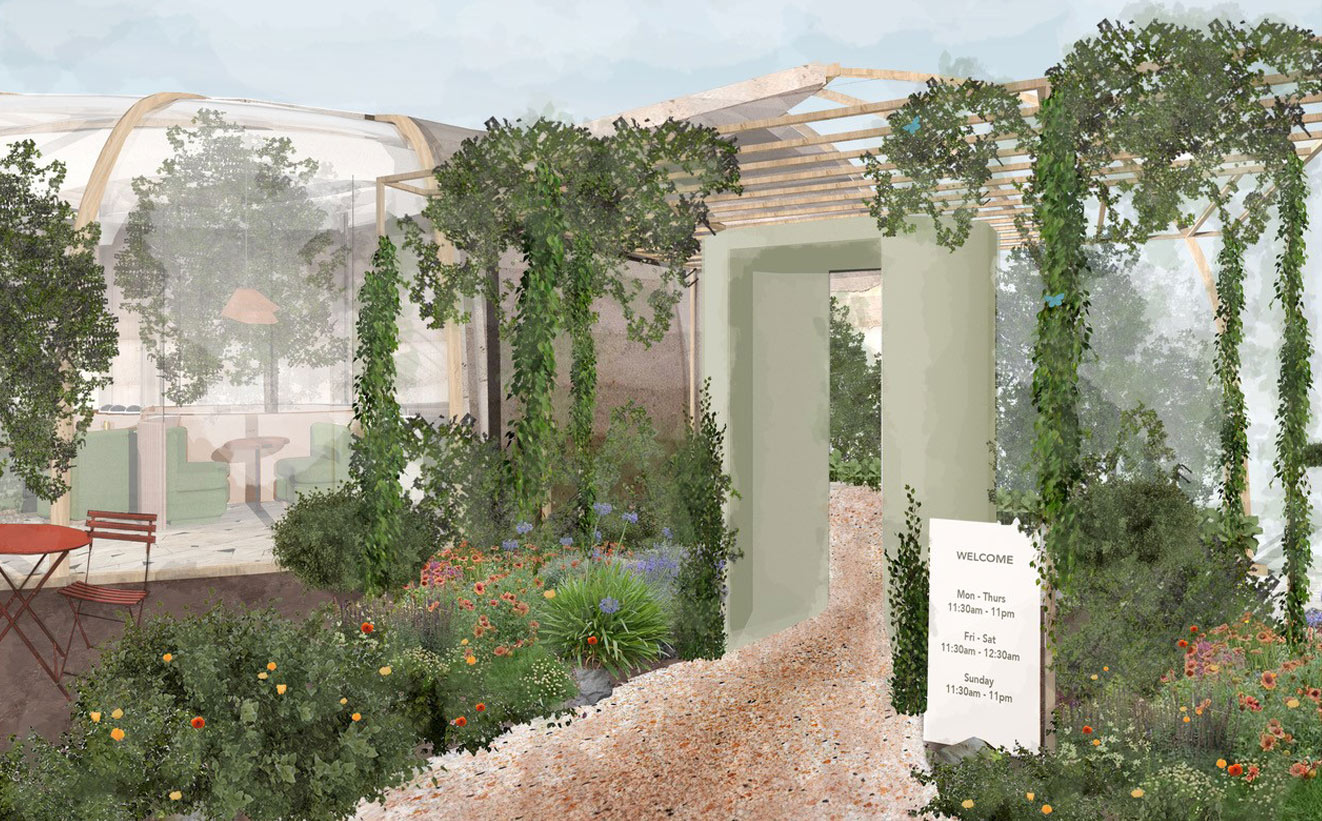
RECONNECT - Restaurant concept
A restaurant reconnecting people with each other and nature, for positive nourishment and well-being
IN COLLABORATION WITH
Boxx Creative & Ekkist
VISUALS
Gustavs Egle
THE CONCEPT
Restaurants have always played a vital part in our ability to connect with one another over a good meal and therefore have a fundamental role to play in our wellbeing and that of the planet. But what happens after months of lockdown and isolation? How do we entice people to return to restaurants for that all-important connection when diners feel unsure or fearful about being in public spaces? This was the question Boxx Creative and I discussed and collaborated on May 2020 during the global lockdown.
We didn't know what life post-lockdown would look like, but we knew people would re-prioritise and seek to improve their positive mental health and wellbeing after everything that had happened. With this change in behaviour, we could see the opportunity for new restaurant concepts to emerge that re-interpret and positively respond to the social and environmental changes that we were experiencing.
THE GOAL
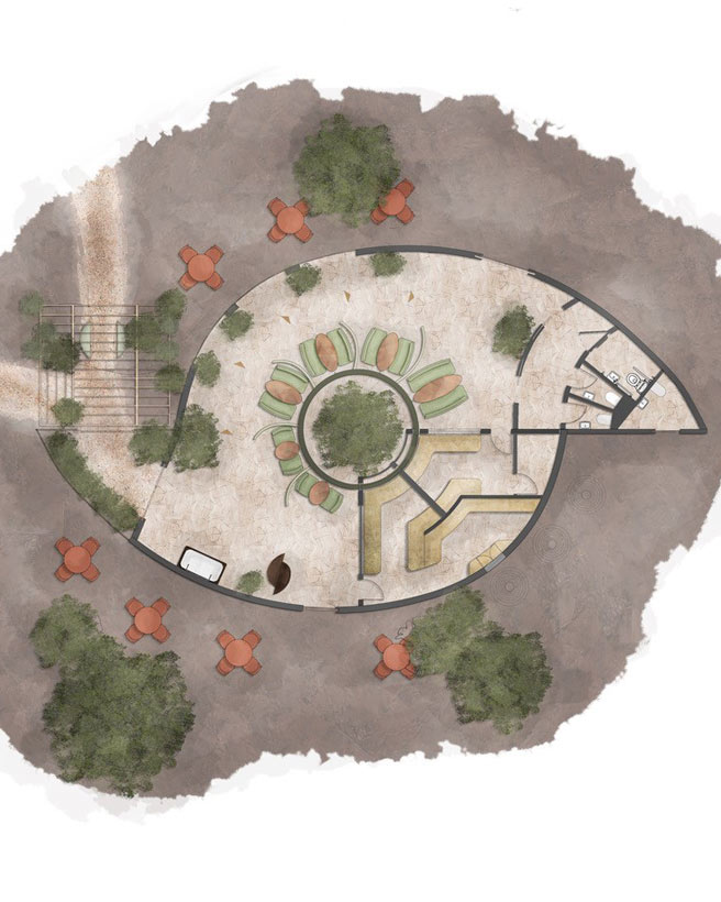
The aim was to design a new restaurant concept that went beyond simply providing a protective space for diners with anti-viral and social distancing measures, and actively enhanced human connection and positive well-being and thereby encouraged people when they come out of isolation to reconnect.

WHAT I DID
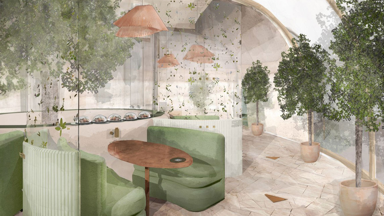
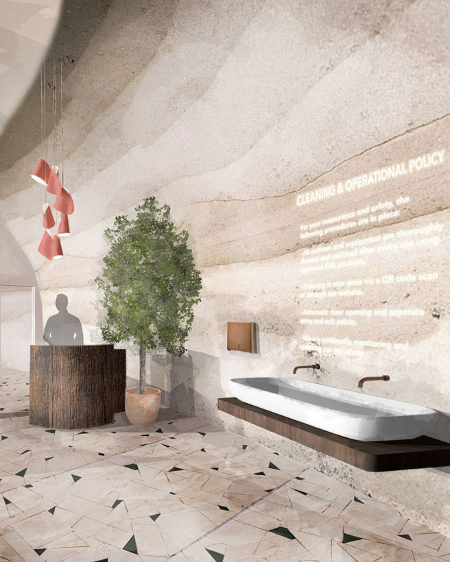
Based on the brief I chose the autumnal colour family as it provides a sense of the familiar here in the UK.
From that seasonal palette I chose the specific nuance of colours so that in combination they would aid in creating an environment where we could feel far more at ease, less anxious and more secure.
And to encourage the relaxed, restorative and connected behaviours we wanted the diners to feel and leave with, I used the lighter, softer end of this seasonal palette to create a soothing emotional experience.
MY GUIDING PRINCIPLES
For this project I utilised Biophilia and Applied Colour & Design Psychology which are based on the principle that humans possess an innate connection with nature, and therefore any design elements that combine to deliver a sense of nature, can be used to improve our wellbeing.
Knowing that diners may come with underlying anxiety, fear or sense of isolation, due to the global lockdown, I focused on creating a colour palette and design style that could seamlessly transition from the outdoors in. This would complement Boxx Creative's immersive, nature-inspired multi-sensory experience design to put people at ease and provide a sense of familiarity, connection and restorative ease.
GET IN TOUCH
Contact Karen to discuss your project further.
GET IN TOUCH
Contact Karen to discuss your project further.
GET IN TOUCH
Contact Karen to discuss your project further.
MORE PROJECTS

Get in Touch
Call me on +44 (0)7941 538 148
or email karen@karenhaller.com
FREE E-BOOK
10 Myths that Limit You Using Colour EffectivelyBy signing up to receive my free e-book, you’ll also receive my newsletter. You can unsubscribe at any time. I process your data in accordance with my privacy policy.
Site by cptcreative | Art Direction by Samuel Blagg | Portrait photography by Kristina Gasperas
© Karen Haller Behavioural Colour & Design Consultancy. All rights reserved.