business branding colour … meaning of purple

Karen Haller
Purple or violet is a combination of the power, energy and strength of red with the integrity and truth of blue. Psychologically purple presents luxury and quality. However, use the wrong tone of purple and it’s the colour that can make a brand look cheap and tacky quicker than any other colour.
colour psychology
Positive qualities of purple are luxury, quality, decadence and wealth. It’s the colour of connecting to ones higher self. On the negative side it can come across as cheap and tacky. It can also been seen as losing touch with reality – being too introspective.
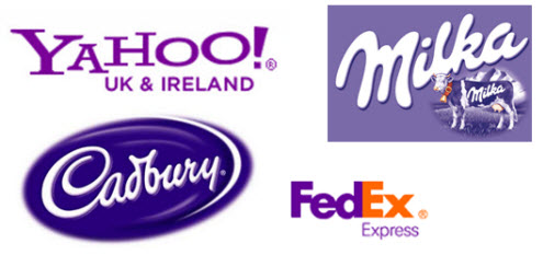
As you can see by the brands selected for this article, all use a different tone of purple. Cadbury chocolate uses a dark rich purple associating their brand with luxury and quality. It’s aimed at the adult market. It’s not difficult to imagine indulging yourself with chocolate and getting lost in daydreaming…
Cadbury went to great length to protect their right to exclusively use a particular tone of purple.
Milka on the other hand uses a light, cheerful purple. The yellow present in the purple makes it a fun, happy colour. Its youthfulness is attractive to children.
brand analysis
If you would like to know if purple is the right colour for your business brand, then why not see if a brand colour analysis is right for you. My clients find when they get their branding colours right, they really get how it represents their brand’s personality and how the right tone will increase brand recognition, attracting their target clientele and lead to increased sales.
How do you respond to a brand that uses red as their primary brand colour? How does it make you feel?
To find out more about the effects colour has on your brand download my free
e-book 7 mistakes most business owners make with their branding colours
Images:FedEx, Yahoo! and Kraft Foods Company


It interesting you mention it can make a brand look tacky quickly. One of the things we learnt when I was in printing and colour matching was that purple was a tricky colour to get just right… but when you do, its a very rich wealthy colour. No wonder in feng shui your wealth area should have lots of purple in it…
Hi Laura,
The more saturated the colour the more luxurious it feels. However what can make purple look cheap and tacky (negative psychological qualities) is the tone of the other colour/s you put with it.